Recruitment today isn’t just about finding candidates.It’s about:
Yet many HR tools feel:
And when the tool slows you down, decision quality suffers.
In recruitment:
a bad UI hides signal,
friction creates shortcuts,
complexity pushes teams back to CVs and gut feeling.
Interfaces don’t just display information. They influence how we judge candidates.
If the tool is confusing, the evaluation becomes biased.
Over the past months, we kept hearing the same things:
“I need to compare candidates faster”
“I want to understand results at a glance”
“I don’t want to interpret scores, I want clarity”
“The experience should feel as professional as the decision”
That feedback led to one conclusion: The interface had to evolve.
We redesigned TestoHire with one obsession:
Help recruiters focus on decisions, not on the tool.
What changed:
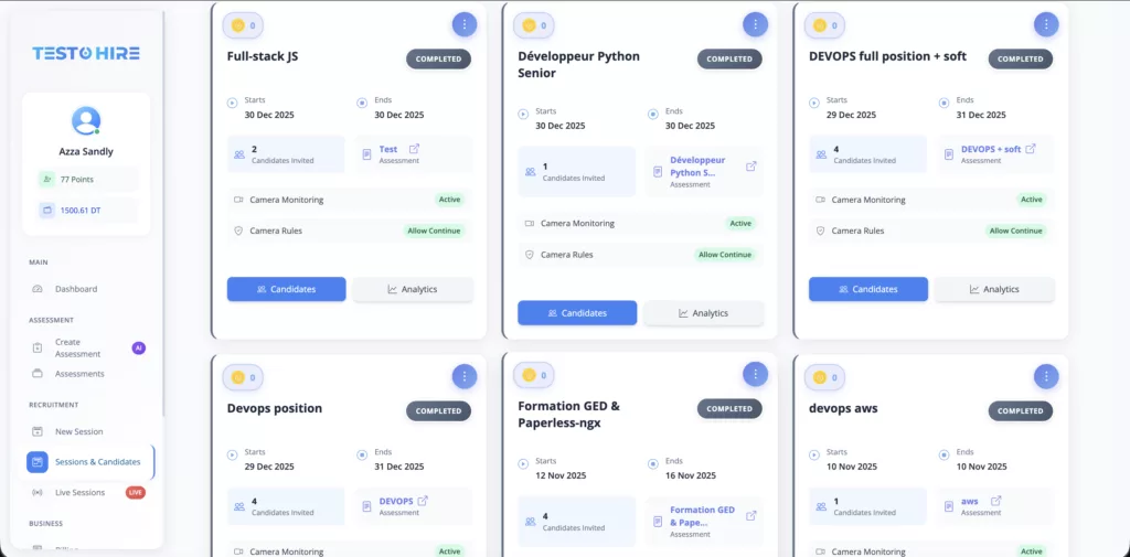
clearer candidate views
better comparison between profiles
simplified navigation
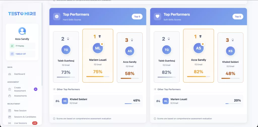
more readable skill insights
a smoother experience for both recruiters and candidates
Same philosophy. Same assessment rigor. A much better experience.
As roles evolve faster:
evaluation becomes more complex
decisions carry more risk
time pressure increases
Your tools should reduce cognitive load, not add to it.
That’s what this redesign is really about.
Good hiring isn’t just about better data.
It’s about better understanding.
And sometimes, that starts with a better interface.
If you’re curious to see how this new interface supports
skills-based, human-centered hiring, you can take a look here 👇